Part 1: Introduction
- Discuss what you did in the previous lab.
- In the previous week of the sand (snow) survey lab we created a snow scene that included a:
- Ridge
- Hill
- Depression
- Valley
- Plain
- Our entire snow scene was 112 centimeters x 88 centimeters. We then conducted our sampling technique, which we chose to do systematic sampling. With this method we sampled in a grid every 8 centimeters. As a group we created a table with x, y and z values and typed those values into excel. We then uploaded the x, y, z table into ArcScene to allow us to see our sampling technique of our snow scene in 3D. Each of us experimented with the following interpolation methods:
- IDW
- Kriging
- Natural Neighbors
- Spline
- TIN
- Interpolation: "is a method of constructing new data points within the range of a discrete set of known data points" (https://www.google.com/gws_rd=ssl#q=interpolation+defintion).
- Later on I will describe each of these interpolation methods individually.
- Discuss what the term 'Data Normalization' means, and how that relates to this lab.
- "The process of dividing one numeric attribute value by another to minimize differences in values based on the size of areas or the number of features in each area. For example, normalizing (dividing) total population by total area yields population per unit area, or density" (http://support.esri.com/en/knowledgebase/GISDictionary/term/normalization). The important parts of this definition that I take away are:
- the purpose of normalizing data is to minimize the differences in values.
- You do this by dividing your values by another value.
- Data Normalization related to this lab because we are trying to create a 3D model of our snow scene, this means our values should have minimal differences depending on which interpolation method we thought represented our original snow scene the best.
- Discuss your data points, and how the interpolation procedure in todays lab will help to visualize that data.
- After uploading our data to ArcScene our data points turned out really well. We created a perfect grid, next was to interpolate the data and create a 3D model of our snow scene. Using the interpolation tools it created a sort of blanket that laid over our data points, showing where elevations were high and where elevations were low with the use of color.
Part 2: Methods
- Write about the advantages and disadvantages of each. Also, provide your own observations as to how well the method ‘fits’ within a realistic representation of your terrain.
- IDW: Inverse Distance Weighted, is a interpolation method directly based on surrounding measured values or on specified mathematical formulas that determine the smoothness of the resulting surface. "IDW interpolation explicitly implements the assumption that things that are close to one another are more alike than those that are farther apart. To predict a value for any unmeasured location, IDW will use the measured values surrounding the prediction location. Those measured values closest to the prediction location will have more influence on the predicted value than those farther away" (ArcHelp).
- Advantage: Really only works well with dense evenly spaces sample points.
- Disadvantage: IDW is an exact interpolation method, meaning the highest and lowest values can only come from the sample points that were actually taken and uploaded to the program. This is why there is a sort of bumpy look to the resulting picture.
- Natural Neighbors: "Estimates cell values for the unknown
location by finding the closest known
measured values and weighting them
according to area (as opposed to distance)" (file:///Users/rachelhopps/Downloads/lecture7_interpolation.pdf)
- Advantage: Works equally well with regularly and irregularly distributed data.
- Disadvantage: Not as smooth as actual surface.
- Kriging: Kriging is a geostatistical method which is based on statistical models that include autocorrelation, these techniques provide some measure of the certainty or accuracy of the predictions. "Kriging measures
distances and direction between
all possible pairs of sample points" (file:///Users/rachelhopps/Downloads/lecture7_interpolation.pdf).
- Advantage: Creates a fairly smooth suface and therefore a more realistic picture of the sampled landscape. "Output contains a table and surface of error values" (file:///Users/rachelhopps/Downloads/lecture7_interpolation.pdf).
- Disadvantage: Difficult equations to understand. Many different ways to apply kriging, and you should understand which kriging method works best for your data.
- Spline: "An interpolation method in which cell values are estimated using a mathematical function that minimizes overall surface curvature, resulting in a smooth surface that passes exactly through the input points" (http://support.esri.com/en/knowledgebase/Gisdictionary/term/spline-interpolation).
- Advantage: Captures trends, the lows and highs even if they are not measured.
- Disadvantage:"If points are too closely clustered and their values are
extremely different, spline has trouble" (file:///Users/rachelhopps/Downloads/lecture7_interpolation.pdf)
- TIN: Triangulated Irregular Network,
- Advantage: All unknown area can be calculated and given a relatively reasonable output.
- Disadvantage: Said to be one of the least accurate interpolation methods. (http://www.geos.ed.ac.uk/~gisteac/gis_book_abridged/files/ch34.pdf).
- You were shown how to bring your data into 3D scene. You were also shown how to export that scene for use in a map layout.
- What format did you export you 3D scene image.
- I first exported the image as a 2D image so I could later open it in ArcMap and add map elements such as the title, legend, north arrow and scale. I saved it as a jpeg and opened it as a picture in ArcMap.
- What orientation did you decide upon?
- I chose two orientations to represent the interpolation methods when I created my maps. One orientation is from a birds eye view, to clearly see the colors and at what elevation they represent. Then I turned the orientation of the 3D map at an angle to show the positive elevation and negative elevation more clearly.
- How did you decide to reflect scale? Why does one need to place scale and orientation in these exports?
- I decided to show the scale by drawing in straight lines parallel to our snow scene and then write in the dimensions next to these lines. Scale and orientation are important because they change a simple picture to an actual map.
Part 3: Results/Discussion 1
- Discuss the results of each method in detail, and refer to the figure, noting where there are issues with the output.
- Revisit your previous lab and make sure you do a detailed job of combining what you did previously with this lab to have what you did carefully documented
- Discuss with your group what you could do differently in a follow up survey
Figure 1: IDW interpolation method. In this particular method we can see the shape of our snow scene being formed. Every 8 centimeters we took a measurement of the z value (elevation) at that particular point. This method shows a little hill at each of the points that we recorded. Our snow scene was not "lumpy" as this interpolation method would have you think. As you can see the hill and valleys are not well defined and rounded by this method.
Figure 2: Kriging Interpolation method. Using this particular method you can now see our snow scene has become more smooth and looks like the real snow scene we originally created. There are still some minor "bumps" where we took our sampling points, but overall kriging represents our data fairly well.
Figure 3: Natural Neighbors Interpolation. This interpolation method is fairly similar to kriging but is not quite as smooth as kriging. There are still minor "bumps" where we recorded our points.
Figure 4: Spline Interpolation Method. this by far created the smoothest overall look of our snow scene. I think this method is the best for accurately showing our snow scene, but with that being said, this method may also tend to over smooth things, and not accurately show the highest and lowest points because those values have been averaged.
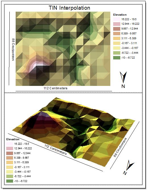
Figure 5: TIN Interpolation method. While this method does show the elevation of our snow landscape better than the IDW interpolation method it still has its disadvantages. The snow landscape that we created was obviously not made of triangles. If this had been smoother it may have accurately shown the snow landscape we created as a group.
Part 4: Revisit your survey (Results Part 2)
Evaluate your best interpolation method and assess where you have data that is lacking.
Figure 6: Spline Interpolation with the new added points. The brighter green points are the new points we as a group recorded in the second week.
- Discuss the results of this 'redo', and relate the quality of the output to your previous survey.
- Now that we have gone back and looked at our results from the various interpolation methods, we decided to do a stratified sample method to create a more accurate image of our snow landscape. We recorded more points from areas that needed a little more help such as the hill, ridge and valley regions. The flat regions of our landscape did not need any more points recorded because those regions would still remain flat regardless of how many points we noted.
Part 5: Summary/Conclusions
- How does this survey relate to other field based surveys? How is the concept the same? How is it different?
- For many surveys you have to take in the landscape and make sure it has been measured well for accuracy purposes. Deciding how you will gather the information is very important. With the first week we chose to do systematic sampling, after seeing this graphed in 3D we realized we needed to record more points in "problem areas." In the second week we chose to add more points by doing stratified sampling which covered these "problem areas" more and made them a little more accurate.
- Is it always realistic to perform such a detailed grid based survey?
- No, I can imagine working in the field you are working at a much bigger scale. If you have more land to sample this costs more money for equipment and workers and also costs more resources.
- Can interpolation methods be used for data other than elevation? How so? Provide examples?
- Yes, I read that interpolation methods can be used for many other things, mostly continuous data such as precipitation. Precipitation can not be measured in every possible location, so many locations are set up to gather information and then that information must be interpolated to "fill in the gaps." This is also done when recording the temperature of the ocean. There are many buoys in the ocean gathering information on the oceans temperatures, this information must also be interpolated to "fill in the gaps" and to create a general picture of where the oceans are heating up, cooling down and remaining the same.