Monday, May 9, 2016

Priory Navigation Activity

Introduction

In this lab we actually went out in the field and used maps we had previously made. The point of this was to allow us to experience working in the field which includes heavy hiking, vegetation and some frustration.


Study Area

We worked in Eau Claire, Wisconsin, more specifically at a school called Priory. The priory is a building owned by the University of Wisconsin Eau Claire and is only 3.4 miles away from the main campus (approximately an 8 minute drive). Around the school is a fielded area but beyond this is heavily wooded forest containing mainly deciduous trees. All of the points we were required to find were in the forested area. This activity took place on May 3rd 2016 so the leaves were just beginning to bud and develop. 

Figure 1: Image of the Priory from Google Earth

Methods

To get to the Priory I carpooled with a couple other students. Once the entire class had made it to the Priory, Dr. Hupy divided us into groups of three and handed each group the maps we had previously made for the lab. Dr. Hupy also gave us our assigned coordinate points, each group was to find 5 points according to the latitude and longitude of each point. Our group marked the general location of the 5 points on our map and then Dr. Hupy explained to us how to work our GPS. We were to have tracking on the entire time to show the entire route we took to find our points and to show how efficient we were to getting to our specified point. We were also to mark each point once we had found the exact lat/long location. 


Figure 2: GPS we used to navigate

Figure 3: Map we used to navigate

Starting in the parking lot and walking directly East, my group and I set out to find our first designated point. After some struggling we managed to identify the point and take a picture of the location. 
Figure 4: First point we found

Our next point we set out North West, this point was not as difficult to find, although we traveled in an unnecessary loop before we finally marked the point. 
Figure 5: Second point we found

The following three points were more difficult to find. As you can see in the map I created below (figure 9) we did a lot of circling before we found these geographic points. 

Figure 6: The 3rd point our group found

As we were walking it increasingly became a workout and extremely hot to the point where I tied my rain jacket around my waste.


Figure 7: The 4th point

We continuously switched off between who had the GPS and navigated to the next point. Although I believe I navigated the first two points and the last (5th point).


Figure 8: The final point!

Finding all five point took us around an hour and a half which may seem like a while but it was very difficult to navigate through some vegetation. As it turns out we were the first group to finish the navigation activity.

Results


Figure 9: Final map with Tracking log and the five designated point we located

Here is the final map I created with the entire track log and the five points we located. As you can see we tried to travel in a general circle in a way that made sense to collect the points. For each point we would try to walk in the general direction that made the most sense (North, East, South, West) and then use our pace count (mine was approximately 66 steps between each box on the UTM grid) . This plan did not always work and then it would lead us to circle.

Conclusion

Although most of us think we want to work outside for our jobs this activity made me realize its not always rainbows and butterflies. Even though this was a nice day it required some heavy hiking and getting scratched by branches. This wasn't all entirely bad but this activity would not have been a joy to experience on a rainy/cold/extremely hot humid day and perfect days here in Wisconsin only come in a blue moon. Our group worked very well and we took turns navigating with the GPS. Some points may have been frustrating to find but we would eventually take a breather pause and refocus. Overall I think if we had more practice with the GPS's we would become better at navigating. 

Sources

http://www.reparacionestopograficas.com/site/index.php?IDDT=97&OPT2=-1&NIVEL1= (GPS image)

Tuesday, April 26, 2016

Processing UAS data in Pix4D

Introduction/Overview of software

We worked with a program called Pix4Dmapper Pro- Educational. We used pictures that were previously taken with a UAV at South Middle School of the football field and surrounding track. "Pix4Dmapper software automatically converts images taken by hand, by drone, or by plane, and delivers highly precise, georeferenced 2D maps and 3D models" (https://pix4d.com/product/pix4dmapper-pro/). 

To get started we first pulled up the Pix4Dmapper and created a new project. I named mine HoppsRa_southmiddletrack. We then simply saved it to our working folder within our own folder (HoppsRa). Next we added all the images we would be using, to do this we selected all 80 of the JPEGs from the southmiddletrack folder. Each of these pictures was geo tagged, meaning each one had its latitude, longitude and the height it was taken at. We accepted the parameters and checked initial processing and unchecked point cloud and mesh and also unchecked DSM, Orthomosaic and Index. The totol time to compute all of the data took 1 hour and 11 minutes. Once this once finished computing we unchecked initial processing, and then checked point cloud and mesh and checked DSM, Orthomosaic and Index so these could now compute and process. This same process was then done for the baseball images.


What is the overlap needed for Pix4D to process imagery?
  • It is recommended that there is at least 75% frontal overlap (with respect to the flight direction), 60% side overlap (flying between tracks).

What if the user is flying over sand/snow, or uniform fields?
For sand/snow:
  • Use a high overlap: At least 85% frontal overlap and at least 70% side overlap
  • Set the exposure setting accordingly to get as much contrast as possible in each image. 

For uniform fields:
  • Increase the overlap between images to at least 85% frontal overlap and at least 70% side overlap.
  • Fly higher. In most cases, flying higher improves the results.
  • Have accurate image geolocation and use the Agriculture template.
Figure 1: Basic route for drone taking pictures of an area of interest

What is Rapid Check?
  • A different processing option, that is much faster but creates a sufficiently less accurate overall image. It reduces the resolution of the original image and therefor reduces the accuracy of the image. 
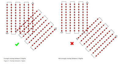
Can Pix4D process multiple flights? What does the pilot need to maintain if so?
  • Yes it can process multiple flights but you need to make sure that:
    • Each plan captures the images with enough overlap
    • There is enough overlap between 2 image acquisition plans
    • The different plans are taken as much as possible under the same conditions (sun direction, weather conditions, no new buildings, etc..)
Figure 2: Showing a good amount of overlap versus a bad amount of overlap of the flight of the drone

Can Pix4D process oblique images? What type of data do you need if so?
  • Yes this means that the camera axis is not perpendicular to the ground, if it were perpendicular to the ground this would be considered a vertical image. 
  • You need data that has high overlap
Figure 3: Showing the differences between vertical images and oblique images. 

Are GCPs necessary for Pix4D? When are they highly recommended?
  • GCPs are optional but recommended. They are highly recommended when processing a project with no image geolocation.
  • If no Ground Control Points are used then:
    • The final results have no scale, orientation, and absolute position information. Therefore they cannot be used for measurements, overlay and comparison with previous results
    • They may produce an inverted 3D model in the rayCloud
    • The 3D reconstruction may not preserve the shape of the surveyed area.
What is the Quality Report?
  • The Quality Report is automatically displayed after each step of processing. It gives updates on how well the processing went and whether all images were able to be processed and if any any were rejected. It also shows a preview of what the finished product should be.


Figure 4: Quality Report of the football field after the initial processing

This small snippet of the Quality Report states that all images were calibrates (80 out of 80) and that none were rejected. And it also states that the time for initial processing was an hour and 10 minutes and 56 seconds.


Methods

Calculate the area of a surface within the Ray Cloud Editor. Export the feature for use in your maps. 

  • To calculate the area I clicked rayCloud and then clicked new surface. I simply clicked the area that I wanted to find the surface area of. Then I exported this data as a shape file to later be used in the maps I made. 

Figure 5: Process of calculating the surface area of part of the baseball field

Figure 6: Process of calculating the surface area of part of the baseball field

Measure the length of a linear feature in the Ray Cloud. Export the feature for use in your maps.

  •  This was fairly similar to measure the area of a surface. I again clicked rayCloud and this time selected new polyline. I measured the length of the bleachers. I then exported this line feature as a shapefile to be used in my maps later on. 
Figure 7: Measuring length of the bleachers using polyline tool
Figure 8: Measuring length of the bleachers using the polyline tool.

Calculate the volume of a 3D object. Export the feature for use in your maps. 
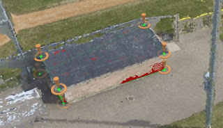
  • This tool required a little more work. I measured the volume of the dug out of the baseball field. Once I had placed the vertices it was required to press the button "Update Measurements" so the math could then be done to find the volume of the dug out. Here are the results below. 

Figure 9: Results for finding volume of baseball dugout
Figure 10: Finding the volume of the dug out and where I placed the vertices. 


Figure 11: Video of baseball field animation

Above (Figure 11) is the video I created showing a 3D view of the baseball field. It may be slow to work at first but it should play. It takes you through different views of the baseball field as if you are seeing it from the drone's perspective.

Results/Maps

Figure 12: Map of Baseball Field

This map shows all of the images put together to create this one image. With this created I could then take measurements of surface area and volume. 

Figure:13 Map of South Middle School Track

After all of this I realized how much the Pix4DMapper program can do and I didn't even begin to use most of its capabilities. The program allows the user to make many other maps that can be used for many other applications. The only unfortunate part about this program is that the computing time takes hours for these images to load onto the computer. 

Sources

  • https://support.pix4d.com/hc/en-us/articles/202557459-Step-1-Before-Starting-a-Project-1-Designing-the-Image-Acquisition-Plan-a-Selecting-the-Image-Acquisition-Plan-Type#gsc.tab=0
  • Photos for maps came from Drone
  • All other screenshots were taken by myself while working with the data

Tuesday, April 19, 2016

Topographic Survey with Total Station

Introduction

This week we used an instrument called a total station. The set up of the station was done by Martin Goettl and our professor Joe Hupy who then described to us how the set up worked. The place that the total station stands is called the known static point or occupied static point. It is very important that once this station is set up that it does not move at all because it is very sensitive and will throw off all measurements if moved in the slightest bit. It is also very important that you measure and record the height of the total station and the height of the prism (receiver). If you change the height of the prism it is crucial you let your partner know so that change can be recorded.

This station, if properly set up, can record the direction and distance of how far the prism (receiver) is when the laser is shot at it from the total station. This technology was bought around 2007 and although it was state of the art at that time, today there are many other advanced technologies such as a total station that can fix its laser on a moving receiver and lidar. The total station that we used was to create a DEM (digital elevation model) of campus. The difference between the total station and doing a distance/azimuth survey is that the total station is set to true north (using back sites that for us were orange flags) and it measures the Z value (elevation).

Study Area

This study took place in Eau Claire, Wisconsin on the UW-Eau Claire campus. The total station was set up outside between the Davies building and the Phillips building. It was placed in the grass not too far from the side walk. Points were then recorded outward from the station (also known as the occupied static point) in all different directions and all different distances. It was a rainy afternoon as we worked outside but all the equipment was waterproof so it shouldn't affect the data. 


Methods

As I mentioned above, the stations were already set up for us and ready to use. Joe Hupy explained to us how the set up worked and then how to actually use the device. The class was split up into groups of two, my group in particular was a group of three so a student did not work alone. Each group took turns going out and surveying the campus, with our group going first. I first lined up the total station to the prism (reciever), and then recorded the points. I did this for about five points and then we all switched positions. I went out and held the prism and then Ethan lined up the total station and Jesse recorded the points. We did this for another five points and then all switched. Next Ethan held the prism, Jesse lined up the total station and I recorded the points for around 7 points. Then we headed back inside and grabbed the next group to go outside. Each person in each group collected around five points until we got the resulting map below. I should mention that when each point was recorded the latitude, longitude, height and height of the datum was recorded.

Tools used:
  • Total station
  • Prism (receiver)
  • Topcon (GPS)
Figure 1: Total station laser (lined this up to the prism)

Figure 2: Prism (received laser)

Figure 3: Height of prism


Figure 4: Screen of Topcon where the individual points were recorded

Figure 5: The entire set up


Results


Figure 1: Table of values recorded from the Total Station

This was the table of numbers (just a snippet of the table) given to us after each group and person had recorded their points. The first column is the point number, the second column is the latitude, the third column is the longitude, the fourth column is the height and the last column is the height of the datum. We were told not to use the height of the datum. I imported the data into ArcMap by clicking File> Add Data> Add X,Y Data. I then imported the table above and set the X Field as latitude, the Y Field as File Format and the Z Field as Ht (g). This sounds completely wrong but the table had shifted over a column from its actual field name, so a few things got jumbled up. Once I put all of this information in I clicked OK the map below was created. 


Figure 2: Map of Survey Points

This is what the layout of the points looked like after we brought them into ArcMap. Unfortunately I was unable to have a basemap work with the data even after projecting the data to NAD 1983 (2011) Wisconsin TM (meters). Had there been a basemap within this map it would have shown that these points were exactly in the correct spots that they had been recorded in because of how accurate the total station is. 

Monday, April 18, 2016

Surveying Point Features using Dual Frequency GPS

Introduction

Each of us in groups of two went out on campus and surveyed various objects with a high precision GPS unit. My partner and I surveyed one tree, one fire hydrant and the five light poles in the parking lot behind the Phillips building. This survey was much different than the distance/azimuth survey taken last week, while that showed the general location of trees, these maps show highly precise locations of certain features. 

Study Area

This study took place in Eau Claire, Wisconsin on the UW-Eau Claire campus in the area behind the Davies building and Phillips building. 

Methods

Groups of two went out behind Phillips in the parking lot to survey objects, each group of two took turns going outside surveying 4-5 features. With my partner, we were the sixth group to head out and take the survey. We simply went out on campus in the parking lot to meet our professor Joe Hupy, who then taught us how to work with and record points on the GPS. My partner and I recorded one tree, one fire hydrant and five light poles. With the tree we recorded one attribute and that was the diameter of the tree. This data was later unable to transfer so it is not mapped below. This GPS would take 20-30 points and then take the average of those points for the location. It would do this process fairly quickly and then record and save the data.


Figure 1: The entire GPS unit
Figure 2: Screen of the GPS while recording the location of an object. 

Results

Below are the maps created from this GPS survey. It shows the various objects we recorded including fire hydrants, garbage cans, light poles, mailboxes, signs, telephones, and trees. Added was a topographic map of campus and each feature is exactly where it is supposed to be. If you were to compare these maps to the maps of last week, there are some major differences. In the distance/azimuth maps the trees appear to be in the Phillips building but using this high tech GPS it places the features where there are in the real world.


Figure 3: Map showing features recorded, color coded.
Figure 4: Unique symbols map of the objects recorded

Conclusion


It depends on what you're surveying but if the technology is available and its working opt to use it. Although distance/azimuth surveys are excellent to use if wondering about the general location of objects,  the high precision GPS worked for this survey method because we wanted to know the precise location of these objects and to learn another way to take a survey. 

Monday, April 11, 2016

Distance/Azimuth Survey

Introduction

For the distance/azimuth survey we learned how to make a map of the general location of trees using only distance and direction from hand held devices. The purpose of doing this was to learn about different ways of taking surveys and collecting geospatial information without the use of a GPS. Technical equipment fails all the time so learning a way that does not require this is very beneficial.

Study Area

This study took place in Eau Claire Wisconsin on the UW-Eau Claire campus. More specifically in the campus mall with our ground control point just north east of the Davies entrance and just north west of the Phillips building. Here trees were surveyed from the ground control point spanning out east. Tree attributes were collected from trees near the Phillips building on the south side of Little Niagra and on the North side of Little Niagra (this is the small stream that runs through the campus).

Methods

All students went outside Phillips to collect the tree species and tree diameter of all 17 trees collected. Materials used were:

  • Sonic Electronic Measuring device
  • Suunto Compass
  • TruPulse 360 Laser

Figure 1: Sonic Electronic Measuring device
Figure 2: Suunto Compass

Figure 3: TruPulse 360 Laser

We took turns using the devices that measured the distance and direction from the anchor point. First we measured the distance from the ground control point to the first tree using the sonic electronic measuring device (Figure 1). This device has two parts the first part being the laser (on the left of figure 1) and the receiver (on the right of figure 1). One person holds the laser at the ground control point, another person holds the receiver at chest height in front of the tree. The laser "shoots" at the receiver allowing it to measure the distance from the laser shooter to the receiver. This number is recorded as the distance from the ground control point to the tree in meters. The next measurement recorded was the azimuth or the direction the tree was from the ground control point (recorded in degrees). For this, a student would hold the suunto compass (figure 2) up to their eye, keeping both eyes open. The azimuth was then recorded for the tree. The TruPulse 360 Laser (figure 3) was also used to measure distance and azimuth, this device can measure both at one time. It was used to double check the measurements of the other devices and to become familiar with multiple measuring devices.  Other attributes that were recorded for the tree were, tree species and tree diameter (Diameter at breast height in centimeters). These steps continued for the next 16 trees. Once all 17 trees were recorded with their specific attributes we recorded the GPS location of the ground control point which was 44.7975 degrees N and 91.5003 degrees W. This is very important for mapping the end results.

Once inside, the class collectively created an excel file with the trees and their according attributes. This was added to ArcMap by clicking File>Add Data>Add XY Data. This prompted a window where the table chosen was Direction_Azimuth3.xlsx> Sheet1$ with the X field being X (X coordinate) and the Y Field being Y (Y coordinate). The coordinate system remained Geographic Coordinate System because the ground control point was recorded in the GCS. This was added to the map where only one point was visible, this is our ground control point. To get the locations of the trees two tools had to be used. First the "Bearing Distance to Line" tool was used. This tool creates a new feature class based on line features constructed from the distance and azimuth field of our table. Once the values were entered for this tool, individual lines appeared to go out in the direction of the trees. The next tool that was used was the "Feature Vertices to Point" tool. This tool placed points at the end of each line, representing the trees we recorded. When entering point type for this tool it was important to change "All" to "End". If you used the default "All" two of every point would show up, which is not what we wanted. We only needed points for the end of each line.

Results

Figure 4: Location of Trees on Campus

Above is a map of the location of Trees recorded on campus (figure 4). It contains the ground control point, the trees recorded and the lines that represent the distance from the ground control point to the trees. It shows the general placement of the trees on campus. From the map it appears that the trees are growing in Phillips. This is not the case and the map looks this way because it is only showing the general area where these trees are located. If we were using a GPS for this particular project then we would be showing the exact location of the trees.
Figure 5: Trees labeled by species on campus

Some patterns I pick up from this is that the River Birch seems to only be located fairly close to Little Niagra. White birch are only growing on the South side of Little Niagra, but that may be because we didn't collect that many tree points.
Figure 6: Trees labeled by their diameter (cm)

Again if more points had been collected there may have been clearer patterns showing up here. With the 17 points displayed it does look like the smaller diameter trees are on the northern side of the map. This may be because these trees are located more in the campus mall which has been constructed fairly recently and had new trees added that obviously would have a small diameter. Trees with a larger diameter appear to be closer to Little Niagra and the Phillips building, possibly because not much change/construction has gone on in these areas and the trees have been able to grow for quite some time.

Conclusion 

Knowing and understanding different ways of gathering data is very important when working with geospatial information. GPS units are not always reliable to work or have a signal when out in the field. Knowing other methods such as the one we learned in this lab of recording a ground control point and then recording objects outward from that point by listing the distance and azimuth, is very important. 

Sources

  • https://blogger.googleusercontent.com/img/b/R29vZ2xl/AVvXsEhUxH3YyerLjhZ-C4jwVcTRIy2PmHfdItSSNTRxDUbz9elaqXhTe2D5cIjF8c7vKPkURrYVPOBZjKVU9h01zT3Pk_fMWStvbBufuKFOpFIsMZy4kWZsReW9C9PE8rctZeiWTZDXugA5nF4/s1600/distancetool.jpg (Sonic Electronic Measuring device image)
  • https://blogger.googleusercontent.com/img/b/R29vZ2xl/AVvXsEi-y_46xOvOmvx65uvbPfNQR17CxgaT-k5NN13LjvqFJNBVh4QELbtZuBPdUD1bu0TJf5NUbGJEpToJxICqJBKgCF7A2RGgwx8V1p6k7i80N58-Emb2Mkn9RnUHdtODqZ6dShKj7pqi3Rg/s1600/compass.jpg (Suunto Compass image)
  • http://2.op.ht/365-240-ffffff/opplanet-laser-technology-trupulse-360b-01.jpg (TruPulse image)


(Look at Tim Condon's page "Field activity 4: Distance Azimuth Survey" for help)

Friday, April 1, 2016

Tree Species on Chippewa River

Introduction

This project was meant to let us be creative in asking our own geographic question, gather the data needed and analyse the results. The research question that I decided I would like to know more about was "Are tree species affected by the flooding of the river?" In other words can only some tree species survive in flooding situations? In order to answer a question like this, the design process must be neat and effective, only gathering attributes that may reveal results to the question being asked. Domains should also be used to ensure less error when entering data out in the field. The process of this particular project design will be explained more in methods.

Study Area

The study area used for this project was the land on the north and south bank of the Chippewa River located on the UW-Eau Claire campus near the walkway bridge in Eau Claire, Wisconsin. This area has experienced frequent flooding after rainfall, and snow melting in the spring. Trees are found near the river that can be within a foot of water for days at a time. So does this frequent flooding affect what trees species can survive in such stressed conditions?

Methods

Before setting out and actually gathering data, the project and organization needed to be set up using ArcCatalog and ArcMap. ArcCatalog is where the geodatabase was set up and designed. For this the geodatabase was named Tree_Study.gdb and within that a point feature class named Trees was created. The Tree feature class had attribute fields created that were tree species, tree diameter (in centimeters), coniferous/deciduous, and notes. These fields were meant to help the study understand what tree species were found in the flood plain and possibly reveal why they could withstand the conditions of flooding. Each attribute field had domains created (with the exception of the notes field) to keep the data more accurate and with less errors entered out in the field.

Gathering the data took place on Thursday March 31st at around 5:00 pm. The equipment used was:
  • Ipad containing
    • Arc collector app
    • Tree identification app (LeafSnapHD)
    • Bad Elf app
  • Bad Elf GPS bluetooth device
  • Tree caliper (used to measure the diameter of trees)
Figure 1: Ipad that was used to collect points
Figure 2: Bad Elf GPS device that enabled ipad to collect points
Figure 3: ArcCollector app used to create a map and collect points of Trees
Figure 4: LeafSnapHD app that helped me identify trees
Figure 5: Bad Elf GPS app
Figure 6: Tree caliper used to measure the diameter of trees

Getting started there were some technical difficulties. The Bad Elf bluetooth device would not connect with the ipad and once it did, data could not be collected. It was quickly realized that the ipad would not collect points on a map that was not already on the device itself. The map being used was downloaded to the ipad using wifi in the Human Sciences and Services building. One practice point was collected to make sure data gathering was working properly, labeled "Oak" but written in the notes it specifies this point as the practice point. Once everything was okay and working, the real data gathering started of trees near the river. Every 10-20 feet a tree was recorded that was within 15 feet of the river's edge. The tree species was recorded using the help of the tree identification app (this was rather difficult as identifying trees could only be done by looking at the bark and branching since leaves, seeds and fruit had not formed yet), the tree diameter using the tree caliper, and whether is was deciduous or coniferous. 29 tree points were collected with their corresponding attributes.


Figure 7: Screen shot from the ipad while I was collecting data out in the field

This data was then extracted from online GIS and the following maps were created in ArcMap showing each individual field that was collected about the trees. This methods should allow us to better understand the tree species and types of trees that tend to grow so close to the river. Tree diameter may reveal other questions that could be further researched.

Results


Figure 8: Map of Tree species near Chippewa River

While only five different species were recorded along the river this reveals what trees can withstand the harsher environment of excess water for a given period of time. Ash trees appear to be the closest to the river bank with Elm, Oak, Birch and possibly some Maple trees scattered just a bit further inland. I say possibly Maple trees because only one was recorded, and this could have been a mis-identification. Further studies could study the distance of these trees from the river bank.

Figure 9: Proportional symbol map of Tree diameters

The diameters of the trees could reveal how big the trees along the river bank could grow. Possibly telling us if an excess of water impairs trees from growing past a certain diameter or if excess water allows trees to grow to a tremendous diameter. This findings don't allow us to conclude anything as tree diameter ranges from 5 to 100 centimeters. With this in mind tree growth may be entirely dependent on the tree species.
Figure 10: Type of tree (whether it was coniferous or deciduous along the river bank of the Chippewa River.

Although the above map may look boring only showing dark green dots of deciduous trees (trees that lose their leaves seasonally as opposed to coniferous trees that keep their leaf needles all year round) it does reveal the common type of tree found along the river bank of the Chippewa. This may tell us that coniferous trees cannot handle the stress of the frequent floods that occur on this river. Again more trees should be gathered in order to make these conclusions.

Conclusion

Proper project design is needed in order to keep the research project at hand neat and organized. Solutions to help this would be to create an organized geodatabase with feature datasets when needed and the corresponding feature classes. These feature classes should have domains if planning to enter attribute data in the field (most research would require this) to keep data integrity and less human error while entering data. The objectives that were executed here did mainly answer the research question, but also raised other questions that could be researched in separate projects. Things that could be changed in this design for next time would be to record more trees, possibly later in the spring and summer months so they would be easier to identify by their leaves, seeds and fruit rather than just by their bark and branching. Having a larger study area wouldn't hurt either, looking at trees farther East and West along the river. 

Sources

  • http://www.stihl.co.uk/STIHL-Products/Hand-Tools-and-Forestry-Accessories/Accessories-for-forestry-use/21027-1625/Tree-calipers.aspx (tree caliper image)
  • http://www.apple.com/shop/buy-ipad/ipad-air-2 (ipad image)
  • http://bad-elf.com/collections (bad elf GPS image)
  • https://play.google.com/store/apps/details?id=com.esri.arcgis.collector (ArcCollector image)
  • https://itunes.apple.com/us/app/leafsnap/id430649829?mt=8 (LeafsnapHD app image)
  • https://www.appannie.com/apps/ios/app/bad-elf-gps/ (bad elf app image)


Sunday, March 20, 2016

Parcel Mapping


           On Tuesday there was a whole day (9 am- 4 pm) dedicated to PLSS and parcel mapping. PLSS stands for Public Land Survey System. We have discussed the PLSS in a few of my classes, GIS and conservation biology but only briefly. The main topic I sat in on was parcel mapping. Parcel mapping takes place at the county level and it is messy business. This is where monuments and “corners” are marked, coordinates recorded and then uploaded to some type of geospatial technology. The first speakers I listened to, Jason Poser and Frank Conkling discussed all the issues they experienced in Buffalo County with parcel mapping, some of which relate to our class.
First it’s important to have people educated in the system they are using. Parcel mappers in Buffalo County were not trained in CAD. This was probably the first thing that we learned in GIS I, not only do you need the software and data but you also need people and processes. There is no way to learn all of GIS on your own. Buffalo County switched over from CAD to parcel fabric. Jason Poser said it took 8 years to complete 40% of the county but only 3 years to complete 30% of the county once they switched over to parcel fabric.
The second important topic they talked about was accuracy. We are learning about this right now in GIS II. The county had no idea how accurate their data was! Accuracy is how close the observed value is to the actual value. Without accuracy the data no longer has integrity and at that point it has no use.
The third point they brought up was money. Counties need money for workers, technology and to obtain GIS licenses. Sometimes I think we students forget this because our university is fortunate enough to have the technology and professors needed for this field of study.

This was just one of many speakers I listened to on Tuesday, but they all had very similar points. Parcel mapping is messy business, people must be educated in this field, and it costs a lot of money. Organization and communication is a large aspect that could possibly improve the struggles of parcel mapping.

Thursday, March 10, 2016

Microclimate

Introduction

  • For this lab we went out on the UW-Eau Claire campus and took GPS points and recorded various aspects of the weather including group number, temperature, wind speed, wind direction, dew point, wind chill and any notes we cared to take for that particular point. From these points I have created a series of maps showing the microclimate of UW-Eau Claire campus. The goal of this lab was for us to become familiar with a new way of collecting gps points and their attributes while out in the field.

Study Area

  • This study took place in Eau Claire Wisconsin, on the UW-Eau Claire campus on March 8th 2016. There were around 6-7 groups of two that took different sections of campus. Each group covered a specific part of campus. These areas include the parking lot across from the Haas Fine Arts center, the parking lot next to Haas Fine Arts Center, the area surrounding the Human Sciences and Services building, the walking bridge, along the shores of the river on either side, all over lower campus (around Putnam Hall, Thomas Hall, the old library, Schofield Hall, Centenniel Hall, Hibbard Humanities Hall, Davies Center, McIntyre Library, Nursing Building, Phillips Science Hall, and the parking lot behind Davies/Phillips Science Hall) and Putnam trail. 

Equipment Used

  • Arc Collector App
  • Ipad
  • Bad Elf app
  • Bad Elf Bluetooth reciever
  • Kestrel weather meter
Figure 1: Bad Elf GPS reciever.


Figure 2: Arc Collector App


Figure 3: Kestrel Weather Meter

Figure 4: Tablet (very similar to Ipad with Arc Collector open on the screen

Methods

  • Before we started collecting points our professor, Dr. Joseph Hupy set up a microclimate geodatabase with domains and feature classes that we would then upload to an app called Arc Collector. 
  • We downloaded the free app Arc Collector on our smart phones. I have the iphone 4 and the app was not compatible with my phone because it did not have IOS 8 on it. Thankfully I brought my ipad with me as I was sure my phone would have some problems. I successfully downloaded Arc Collector on my ipad. 
  • At this point we needed to go on ArcMap and sign into our enterprise account (UWEC) and then sign in with our school username and password. Once we were signed in on ArcMap we also needed to sign in on the Esri website the same way. This brought up a nice interactive map where we zoomed in on our location of Eau Claire campus. Now this map was ready to open on our Arc Collector app, where we would use our smart phones (in my case my ipad) to collect our microclimate points. 
  • We went out to collect points from our assigned area from last week. My partner Ethan and I were assigned to the area stretching from the on campus church, along the river down to Putnam trail. I quickly realized my ipad was unable to collect points without wifi, because it could not pick up my position. 
  • We used Ethan's phone for the time being and recorded the points with the specified attributes of temperature, wind speed, wind direction, dew point and wind chill, using a kestrel device that has a small fan to measure wind speed and other components. 
  • When we collected around 20 points we came back inside and I explained to Dr. Hupy the technical difficulty I had experienced. He gave me a device called "bad elf" that was blutooth enabled to track my position fairly accurately. All I had to do for this was download the bad elf app and connect to the device via blutooth. 
  • With the last remaining hour of class I went back out to campus and took a sample point to see if the technology was working. It appeared it was so I continued taking points around the campus mall by myself. Below is a map of the points I took (Figure 5)

Results/Discussion

Figure 5: The points I collected myself with my ipad using the arc collector app and bad elf device. 

  • I thought it was interesting to map the attribute of temperature for these few points and it created an interesting pattern. When I started collected points it was around 5:00 pm, the first point I collected is the orange dot, indicating 74 degrees fareinheit. I continued my walk across Little Niagra where I took a slight right and collected my next three points indicated by yellow dots meaning the temperature was 71 degrees fareinheit. From there I headed towards Schofield Hall where I collected my fifth point indicated by a light green dot meaning it was 70 degrees there. My next four points are indicated by the darker green dots meaning it was 69 degrees fareinheit. And my last five points are indicated by blue dots indicating the temperature was 68 degrees fareinheit. Essentially I made a large circle around the campus mall but the temperature gradually decreased as I continued collecting points. Collecting these points took around 30-40 minutes and sunset was at 6:03 pm. The setting sun may give us some reason as to why the temperature was decreasing as I collected points in the campus mall. 
  • There is one point I want to note and that is the point depicted as "practice point." This point I collected for the sole purpose to see if my ipad was working with the bad elf blutooth capability, so I did not record any attributes at this point as I just wanted to see that the location was working. 
  • After collecting my own data I added this to arc map along with other group's data and created two more maps below (Figure 6 and Figure 7). 
Figure 6: All data points collected by all groups. Mapped here according to temperature. 
  • This map reveals microclimate temperatures on the UW-Eau Claire campus and while I can not explain why the map turned out this way I can explain trends and give theories as to why it is this way. I noticed that temperatures seem to stay fairly warm in parking lots and the campus mall area. My thought as to why this is is because the sun was out on this clear afternoon warming the surface of concrete and creating warmer temperatures over these blacktop/concrete areas. 
  • I then noticed that the cooler temperatures (indicated by light and dark green dots) of 65-67 degrees farienhiet tend to be along Putnam trail which is heavily forested. My theory of why these temperatures were cooler is that the trees blocked out much up the light, therefor these shadier regions would have been slightly cooler. 
  • Then there is one point of 54 degrees fareinheit. This point seems to very off according to the rest of the temperatures. This could have been from a faulty kestrel weather meter or possibly the person collecting that point recorded the wrong number for temperature. 
  • There is a small point and it indicates the temperature is zero. Again this was the point I recorded as a practice to see if my Ipad and bad elf receiver were picking up my location so I did not record any of the weather attributes at this particular point.
Figure 7: Map showing wind speed according to the size of the circle, indicated by 1-10 miles per hour. 
  • There are only a few things I would like to point out about this microclimate wind speed map of UW-Eau Claire. 
  • It seems that wind speed is slightly higher on the walkway bridge. This may be because this is an open suspended area above water. 
  • The other aspect of this map that I want to point out is the higher wind speed on the northern side of the river. This may be because the winds were coming from the west and this particular part of campus does not have as many buildings to block the wind. 

Conclusions

  • The purpose of this lab was to get outside, collect GPS points with weather attributes in a new way, and become familiar with the kestrel weather meter. We were also told to create microclimate maps that mapped a particular attribute or two. With these series of maps I hope to portray some data indicating different aspects of microclimate on the UW-Eau Claire campus.
  • Attempting various ways to collect data 

Sources

  • http://www.trulygadgets.com/files/2014/02/Bad-Elf-Gps-Pro-Bluetooth-Gps-Data-Logger.jpg (image)
  • http://cdn.shopify.com/s/files/1/0084/9012/products/Kestrel-Meter-3000-Red_large.jpg?v=1440600760 (Kestrel image)
  • https://lh5.ggpht.com/8gcCe1rUyHdDE_sVjN2X7XMITyvAr7v_dd9skKweQ546qirYBBSxYV_UoqQ3ri81zK3j=w300 (Arc Collector App)
  • http://webmapsolutions.com/assets/blog/suamobile.png (Ipad image)